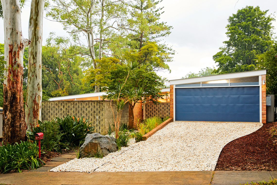
A home designed in 1957 by renowned architect Harry Seidler receives a respectful modern uplift, transforming it into a modish family home. Originally, the dwelling was modest, resembling other typical project homes popular in the 1950s and ’60s. It featured three bedrooms, two bathrooms, and a single-car garage. However, homeowners Tiffany and Lorenz saw its potential when other buyers overlooked it. “It was important to preserve the home as much as possible while improving its functionality and adding a new wing for space,” they say.
Post renovation, it now has four bedrooms, two-and-a-half bathrooms, two living spaces, a two-car garage and a pool. The heritage overlay meant the style of the facade had to remain. “This posed a slight challenge for us,” explain Tiffany and Lorenz, “but ultimately we were approved for a two-car garage which was the linchpin for the new wing as it is obscured from the street.”

The new elements in the home stay true to the Modernism era, enhancing the property’s functionality while adding another layer of history to this architecturally designed residence. Where possible, the team restored and refurbished materials. Tiffany and Lorenz explain that when updating elements, they carefully selected new materials to reference the originals. “For example, we sourced main bathroom flooring that evokes the original mosaic tiles, while giving it a modern twist,” they comment. They also refurbished and reinstalled the original stainless-steel kitchen sink and porcelain laundry tub.
Moreover, the home features many inspired refurbishments that demonstrate ways to extend the longevity of materials. For instance, the rumpus room floor now showcases timber salvaged from the original living room. Even the joinery from the old master bedroom has received a new lease on life, now serving as the TV unit.

The house has a bold palette of primary colours; the new wing is distinguished from the old by the introduction of secondary colours, green and purple.
There is much to love about this family home. When asked the tricky question of which part of the renovation they favored, the couple found themselves torn. “The rumpus room with its high ceilings — it’s filled with natural light and has a leafy outlook,” they say. “The dining room (the original breezeway) is a close second — it has an alfresco feel with the 9m skylight that functions both to allow in natural light and to mark out where old meets new.”
We think the whole project is a class act.
Photography: Sally Griffiths


