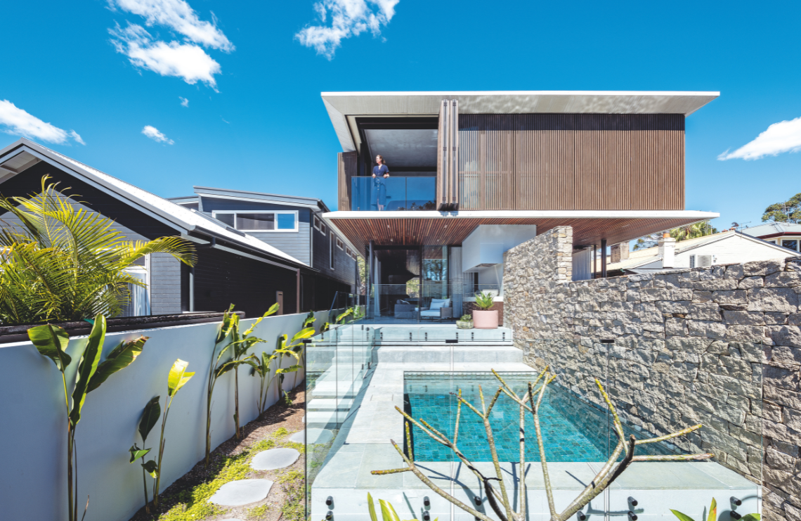
A semi that looks anything but! With a forward-thinking design and swathes of charisma, this home is a game changer.
Prior to the development, architect Nicholas Byrne described the semi as a typically arts and crafts-style dwelling. “In contrast to the current design, it had limited glazing and little connection to the outdoors,” he says. “Materiality consisted of face brickwork and a terracotta-tiled roof.”

The brief was to make a semi not feel like a semi. “Traditionally, semi-detached dwellings are restrained and ‘closed’ on both the central dividing wall and the boundary wall,” says Nicholas. The design team rolled up their sleeves and got to work. In keeping with the brief, the first thing they did was turn the concept of a classic semi on its head by opening up spaces and designing it to connect seamlessly with the outdoor environment.
The project team, made up of the developer, architect, interior designer and builder, worked closely with each other to resolve any challenges as they arose. With such a complex project, communication was critical. Lara Saunders, an associate at Interior Design, says the final result was a perfect fit for what they’d conceptualised. “The two town homes are defined by low-profile frames, uninterrupted lines and a palette fashioned from raw and authentic materials,” she says.

The sense of connectedness and the clean lines are apparent. That, in essence, is what makes this project so special, according to Nicholas. “The duplex typology has been explored in such a way that from the outside looking in, the two homes appear seamless, streamlined and harmonious,” he says.
The duplexes are a design triumph of light, warmth and character-filled living spaces that take advantage of their prime location in Manly, a leafy suburb on Sydney’s northern beaches. Given its elevated position, there is ample ventilation and cross-flow of natural cooling breezes. Sunlight streams into the home, infusing the living spaces that flow to the home’s exterior living areas with warmth and life. Through good design, the boundaries are effortlessly blurred.

The duplexes are home to a developer and a school friend who relocated from Hong Kong back to Australia. Both families have children and enjoy Manly’s sun-kissed beaches and laid-back lifestyle. They are delighted with the final result.
For both Nicholas and Lara, there is much to love in this project. Nicholas’s favourite aspect is the ground-floor living spaces. “I love the feel of the ground-floor living room. With doors open, this space feels like an indoor balcony,” he says. Lara likes the timber battens that offer climatic control. “I love how the building can breathe, with the batten shutters opening and closing to suit the weather,” she says. Another favourite aspect was the spiral stairs, although their delivery proved to be quite a nail biter. “The stairs were in transit from Melbourne and went MIA for a brief period of time during the pandemic,” she says. “Watching them being craned into the building was a sight to behold and it was truly satisfying seeing how perfectly snug they fitted in.”

With ample room for growing families, there’s plenty of space, with soaring ceilings visually extending the interior living area. At the heart of the home is a large island bench where the family can gather and connect with each other. Lara says it is also the meeting point of the home, with streamlined kitchen and living room joinery connecting the living spaces in natural stone and walnut veneer.
The home is spread over three levels. The ground floor houses both formal and informal living spaces, the kitchen, pantry, powder room and garage, as well as relaxed outdoor living zones with a barbecue and sparkling swimming pool. The sweeping sculpted spiral stairwell makes a striking design statement, connecting to the bedrooms and bathrooms on level one. In the basement, a wine cellar, laundry and theatre room round out the living and utility spaces
on offer.

Organic, earthy materials add contemporary style, including warm natural timber, stone and concrete. Nick says the clients’ love of Brazilian architecture underpinned the design and is also highlighted in the home’s connection to the outdoors. “It flowed through the thinking and allowed a design that breathed and took full advantage of the beautiful Sydney climate,” he shares.


